SAKOIRO
Brand Design [2024]
Sakoiro is an innovative brand that blends the wine traditions of Japan and Spain, creating a unique experience for wine lovers. This union of two worlds calls for graphic design that reflects the rich heritage and modernity of both countries.
The first step in developing the graphic design for Sakoiro was to conduct extensive research into the traditions of these two countries. Traditional wine labels from both regions were studied, as well as contemporary trends in wine label design. In addition, distinctive cultural and aesthetic elements from both countries were explored.
Based on this research, the central concept of the design was defined: the fusion of the traditional and the modern, the Japanese and the Spanish. This concept was translated into a design that had to be elegant, sophisticated and innovative at the same time. The label had to communicate the quality, history and uniqueness of the Sakoiro brand.
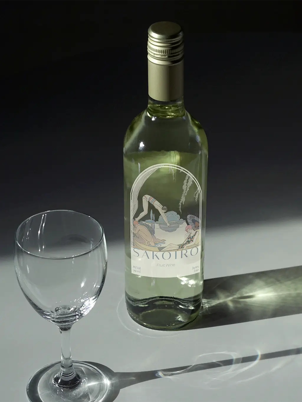
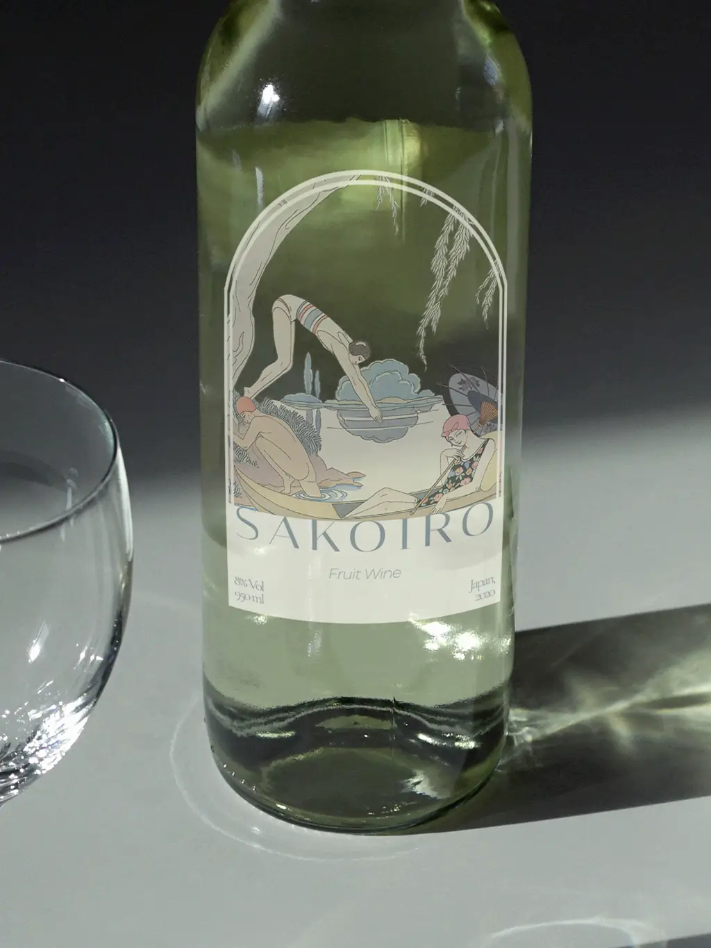
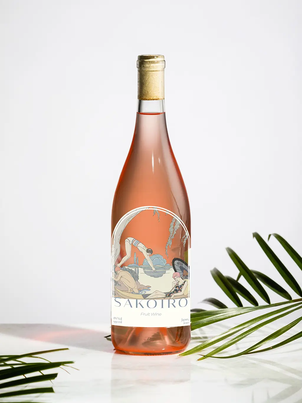
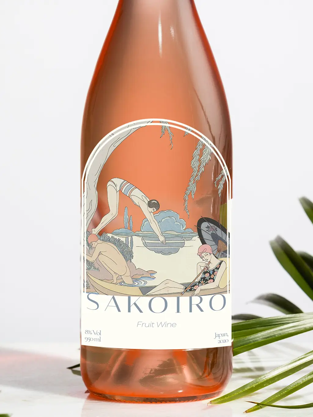
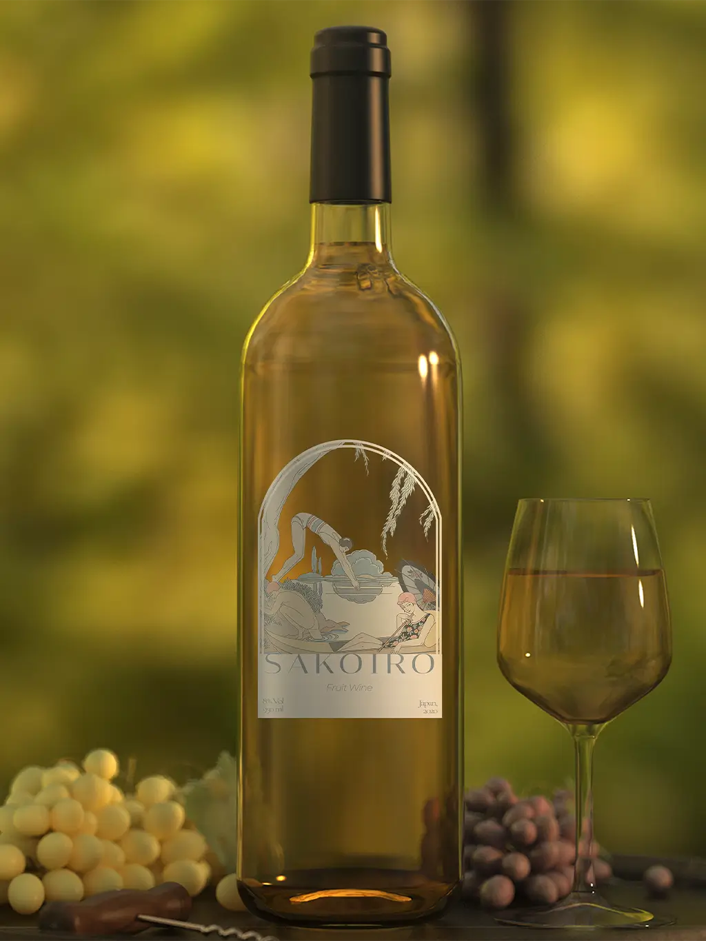
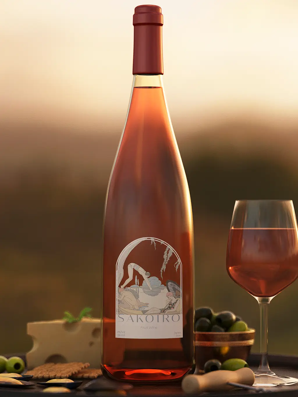
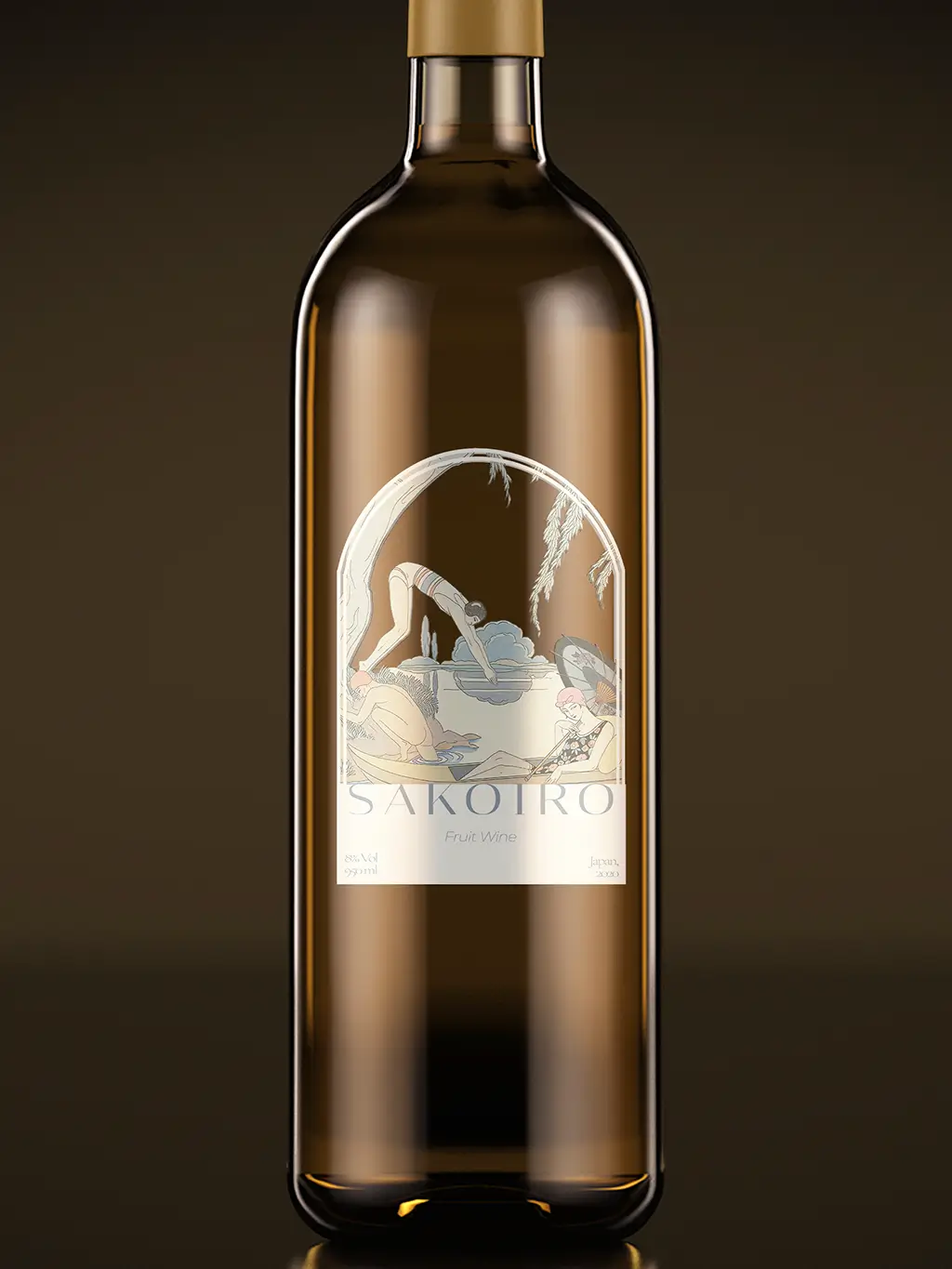
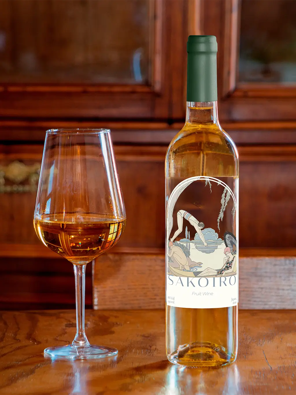
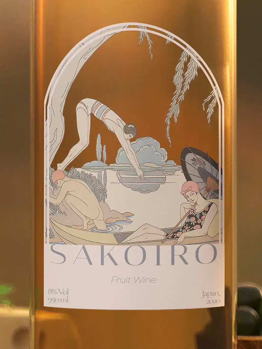
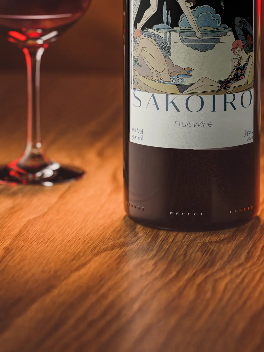
The Sakoiro logo was designed to include only the name without any icon. An elegant and contemporary typeface was chosen, with stylised characters reminiscent of Japanese calligraphy but with a modern twist.
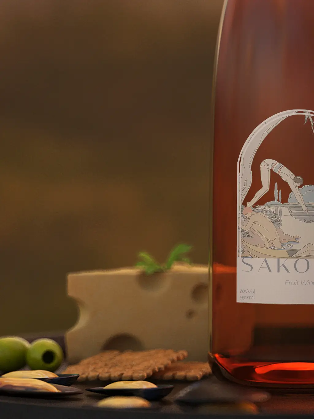
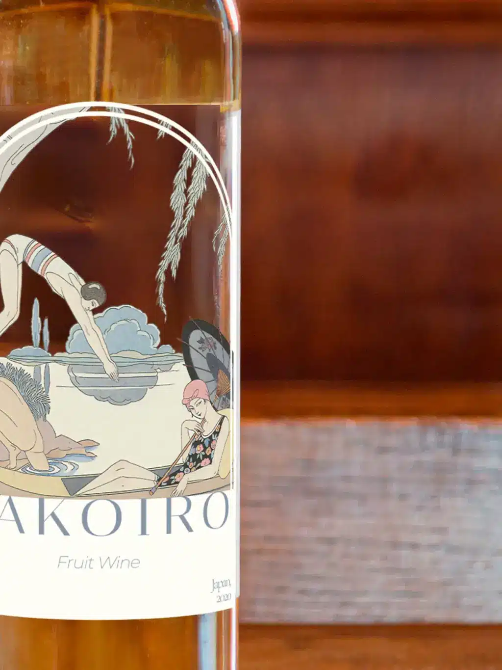
We decided that the label should incorporate traditional Japanese imagery such as waves, lakes, and characteristic trees. These graphic elements were integrated harmoniously, creating a visually appealing and meaningful scene.
The creative process included several stages of sketching and revision. Initially, several design concepts were presented, which were refined and adjusted based on feedback until a final design was achieved that perfectly encapsulated the brand’s identity.
SAKOIRO
Brand Design [2024]