ANNA ATKINS EXHIBITION
Editorial Design [2023]
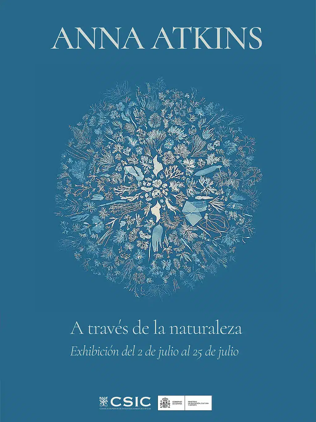
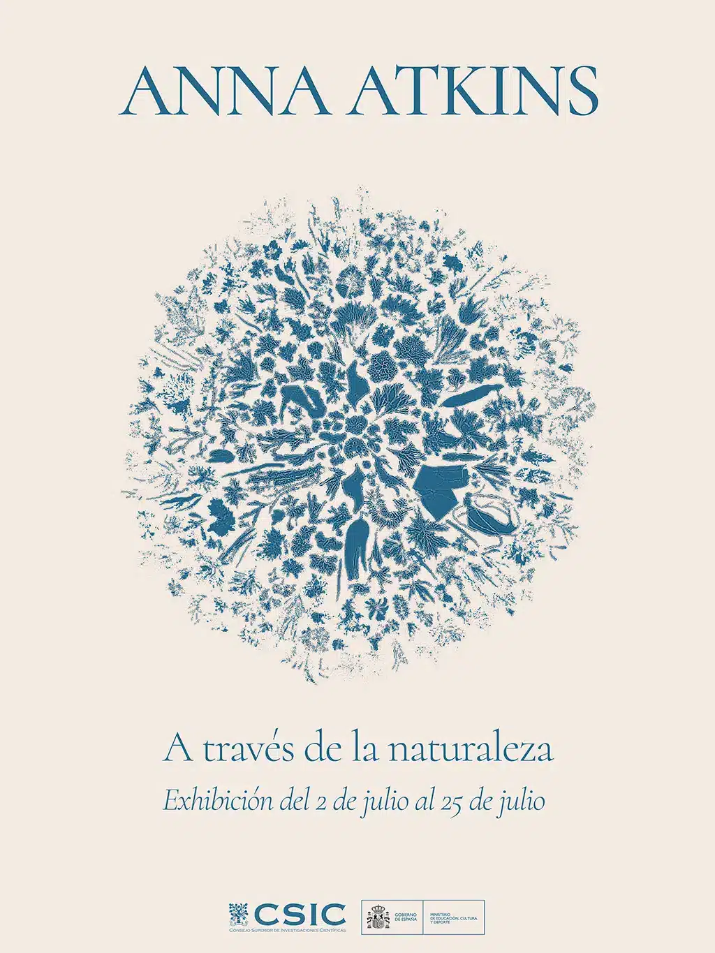
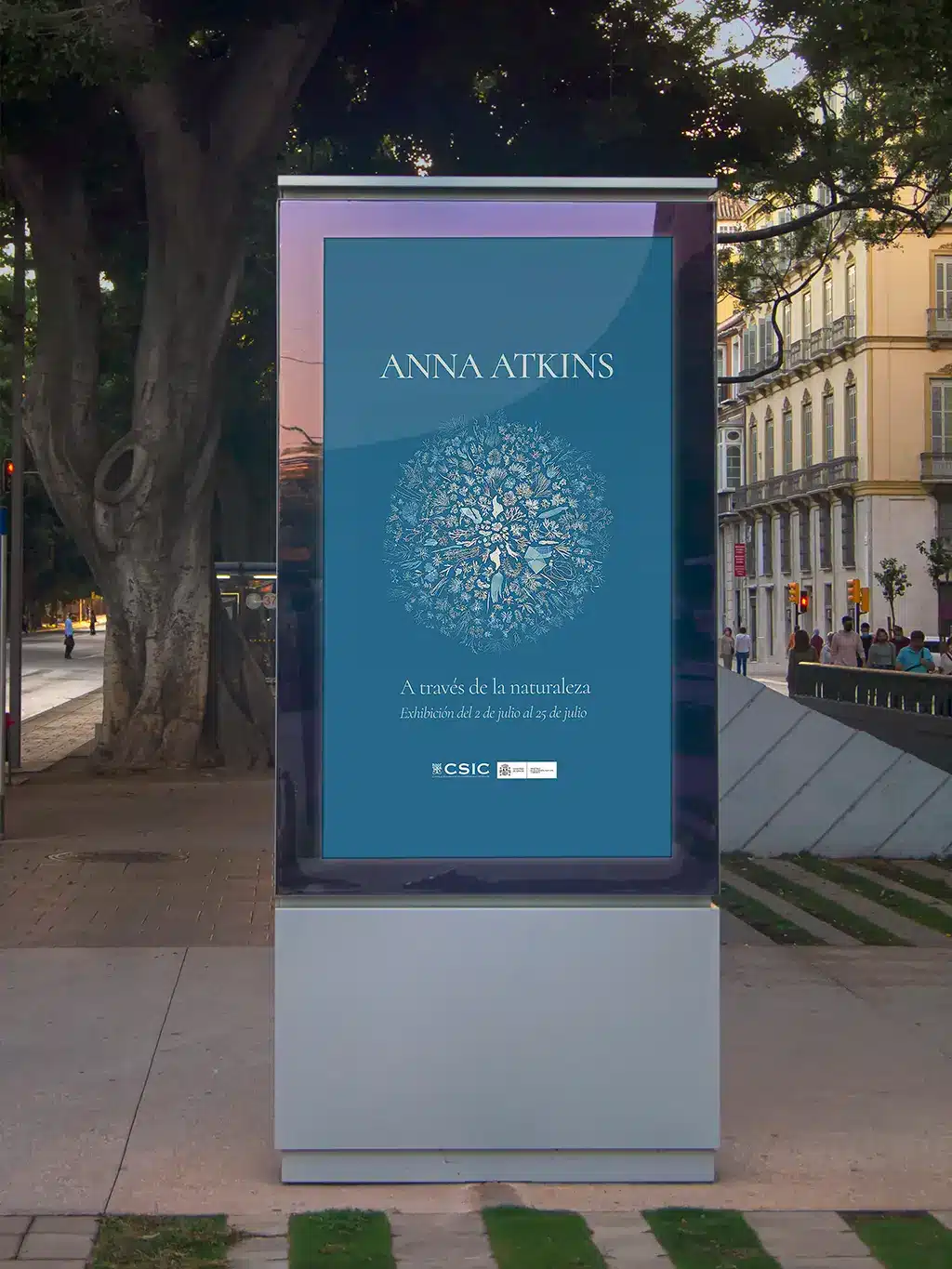
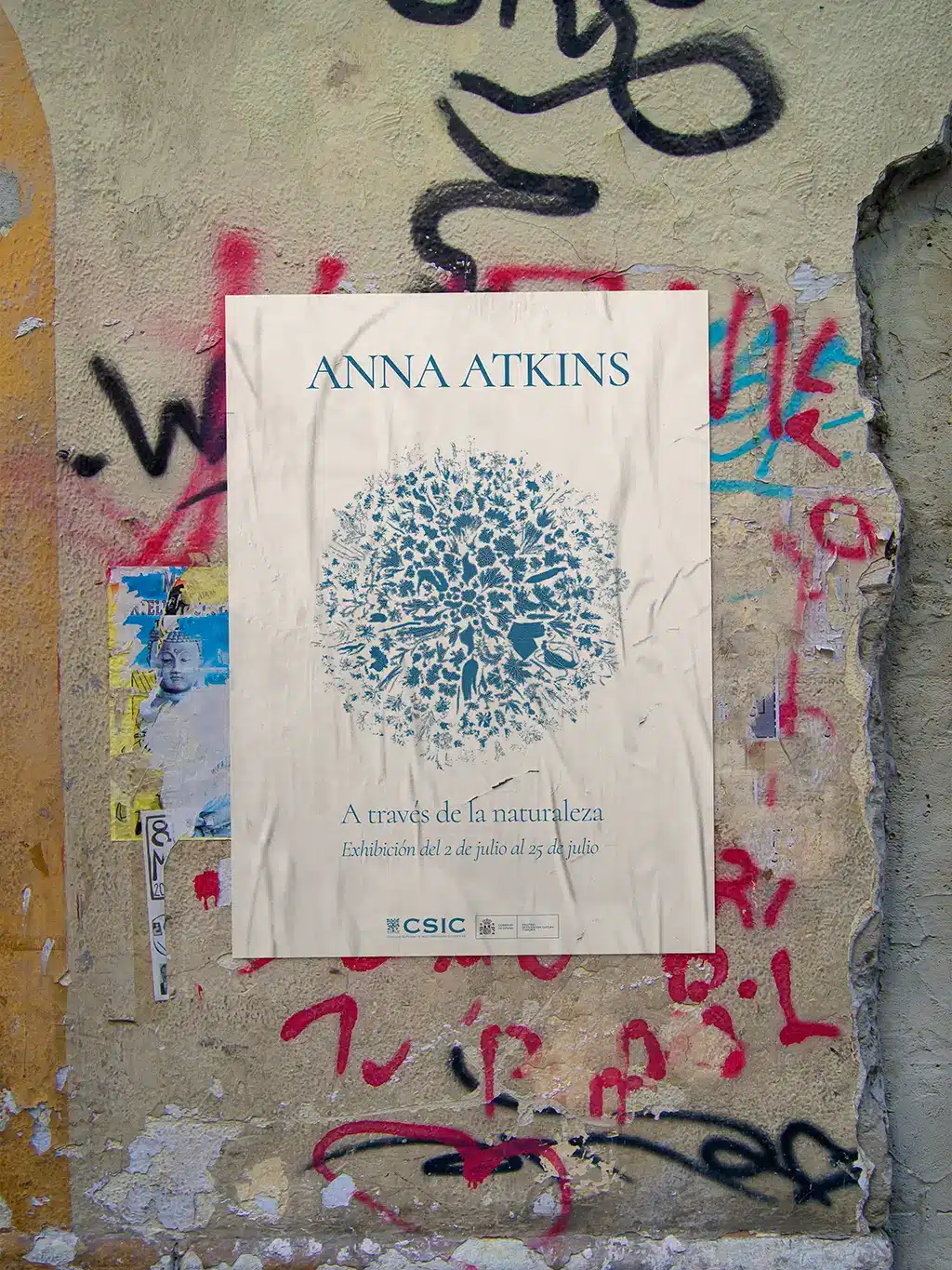
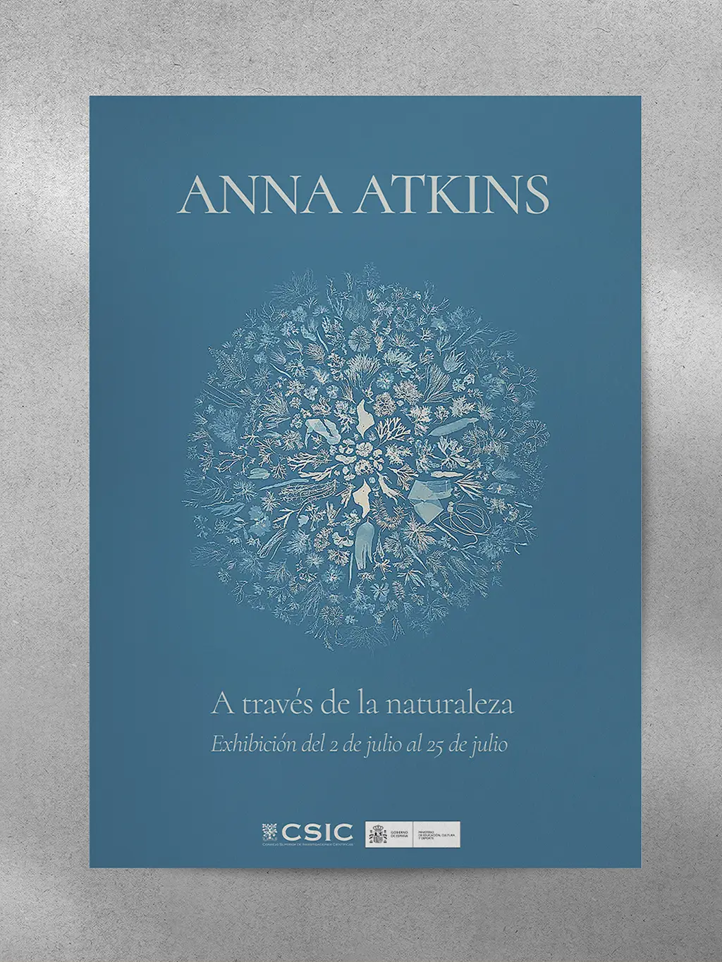
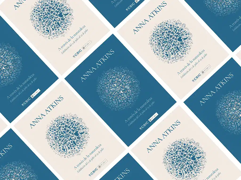
For the exhibition dedicated to Anna Atkins, a pioneer of botanical photography, the graphic design had to pay tribute to her legacy and distinctive style. The choice of colours and visual elements was carefully selected to reflect her iconic work.
The graphic design focuses on a blue and white colour palette, inspired by the cyanotype technique that Anna Atkins popularised. This printing method, which produces images in shades of blue, was fundamental to her work and became her hallmark.
One of Anna Atkins’ original botanical photographs was selected as the main image, providing a visually appealing focal point for the exhibition.
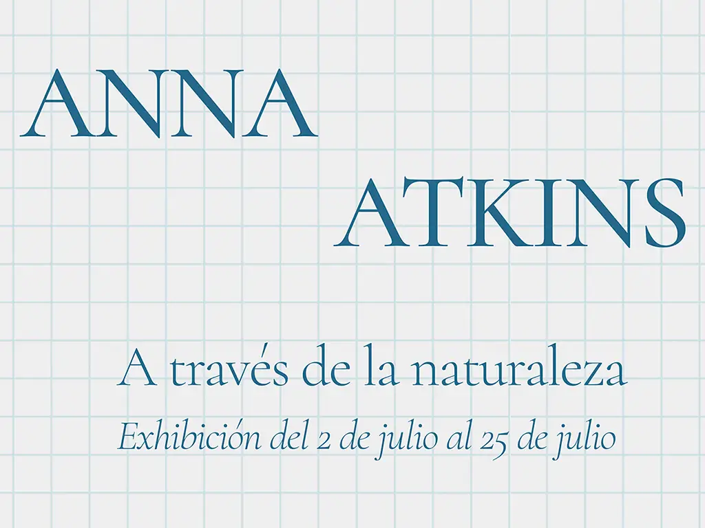
The typography used is elegant and simple, allowing the main image to take centre stage. A serif typeface was chosen to evoke a sense of history and tradition, appropriate for a historical figure such as Atkins.
ANNA ATKINS EXHIBITION
Editorial Design [2023]