Damián Castagna
Brand Design [2023]
Damián Castagna was born out of a passion for the care and conservation of horses dedicated to polo. From Argentina, they travel the world with headquarters in southern Spain, Cádiz. They stand out for being a reliable brand, where the diligence with which they treat horses and the products used on them are top notch.
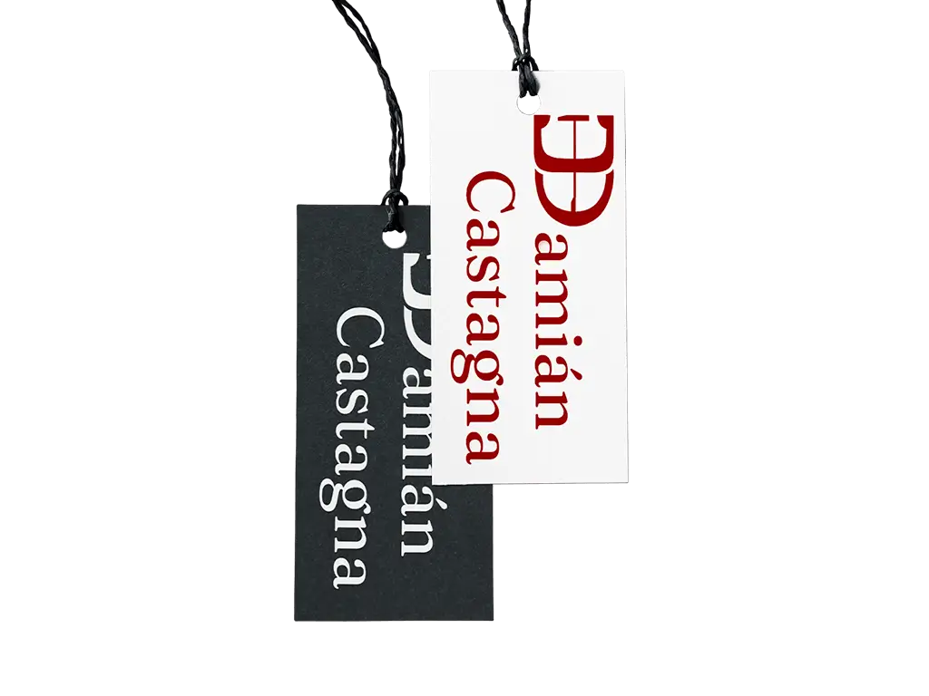
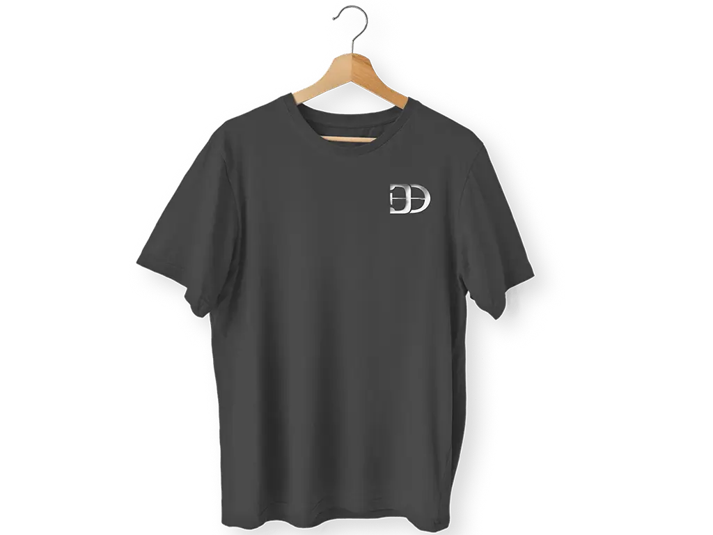
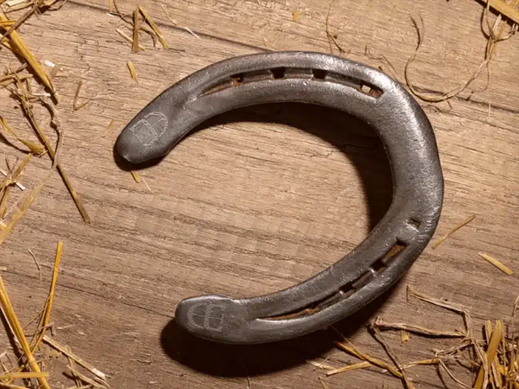
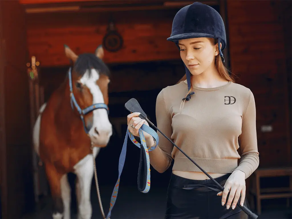
The owner commissioned us to develop their graphic identity, wanting it to be adaptable to different surfaces used in their day-to-day work.
Taking into account their main activity as blacksmiths and later, maintenance and transport of animals, we knew that the brand needed to have a strong impact. The main objective was to evoke a relationship between the strength of the work and the warmth of the countryside, without losing the elegance of the sport.
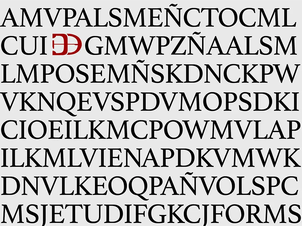
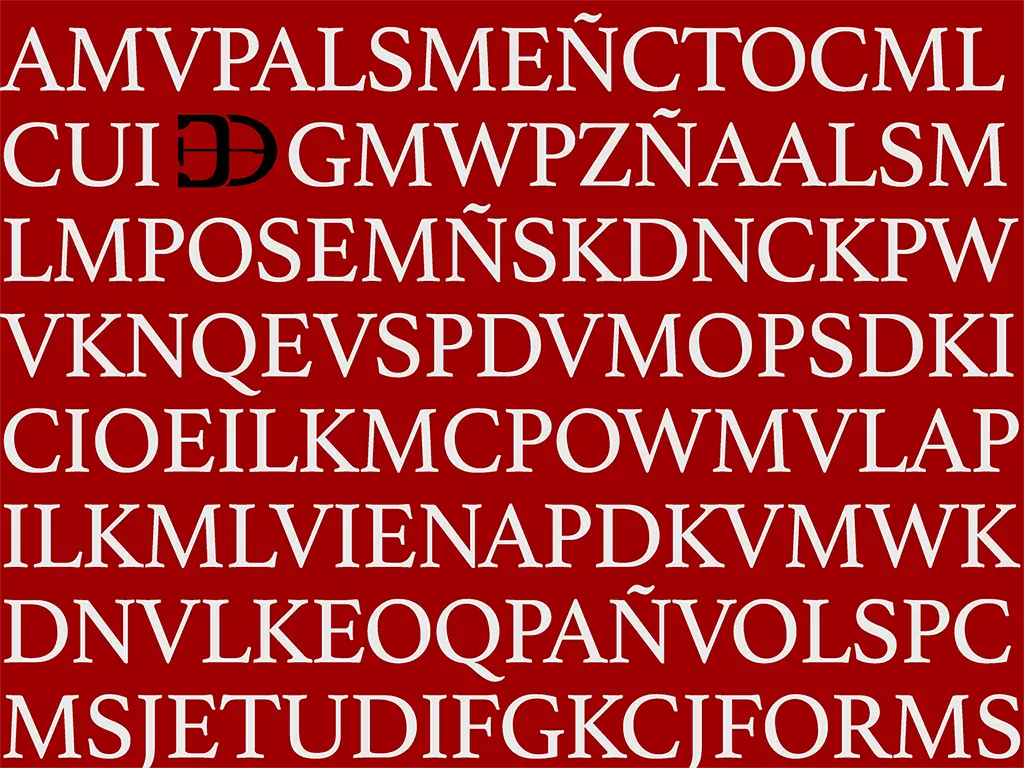
I decided to use the Fraunces typeface, inspired by early 20th-century typefaces such as Windsor, Souvenir and Cooper. Fraunces plays with heavy ink but combines it with a very distinctive cursive style influenced by Art Nouveau. With this combination, we achieved a logo that reflects the name with both refinement and a contemporary look.
The beginning of the name will be accompanied by the logo, where we can see the letter D for Damián Castagno, a horseshoe and a polo mallet. With this combination, we wanted to give the image fluidity so that it would not be visually heavy and we could play with it when placing this logo in other places.


Damián Castagna
Brand Design [2023]
Damián Castagna was born out of a passion for the care and conservation of horses dedicated to polo. From Argentina, they travel the world with headquarters in southern Spain, Cádiz. They stand out for being a reliable brand, where the diligence with which they treat horses and the products used on them are top notch.
The owner commissioned us to develop their graphic identity, wanting it to be adaptable to different surfaces used in their day-to-day work.
Taking into account their main activity as blacksmiths and later, maintenance and transport of animals, we knew that the brand needed to have a strong impact. The main objective was to evoke a relationship between the strength of the work and the warmth of the countryside, without losing the elegance of the sport.
I decided to use the Fraunces typeface, inspired by early 20th-century typefaces such as Windsor, Souvenir and Cooper. Fraunces plays with heavy ink but combines it with a very distinctive cursive style influenced by Art Nouveau. With this combination, we achieved a logo that reflects the name with both refinement and a contemporary look.
The beginning of the name will be accompanied by the logo, where we can see the letter D for Damián Castagno, a horseshoe and a polo mallet. With this combination, we wanted to give the image fluidity so that it would not be visually heavy and we could play with it when placing this logo in other places.