For: Oglio

From: KROLSTUDIOO.COM

Madrid, España

OGLIO

Brand Design [2025]

Oglio is a conceptual Italian fine jewellery brand that I developed as part of my portfolio. The idea came from imagining a family business with a heritage dating back to 1978, dedicated to timeless pieces that combine tradition and contemporary design. The big challenge was to build a visual identity from scratch that conveyed elegance, heritage and modernity at the same time.
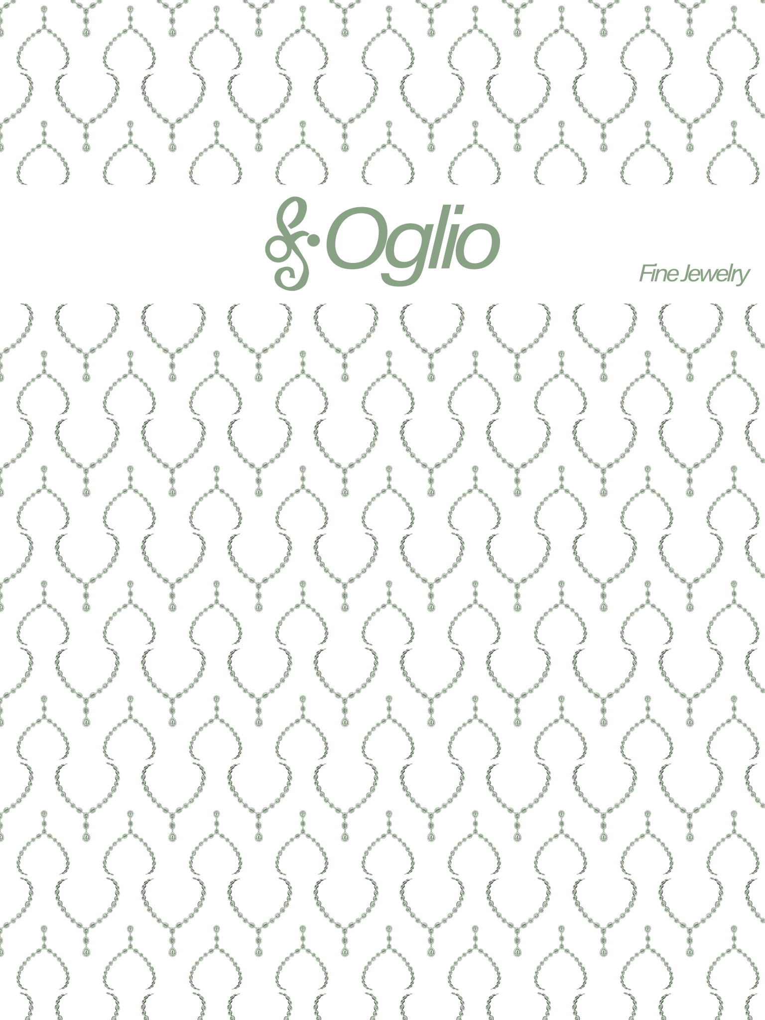
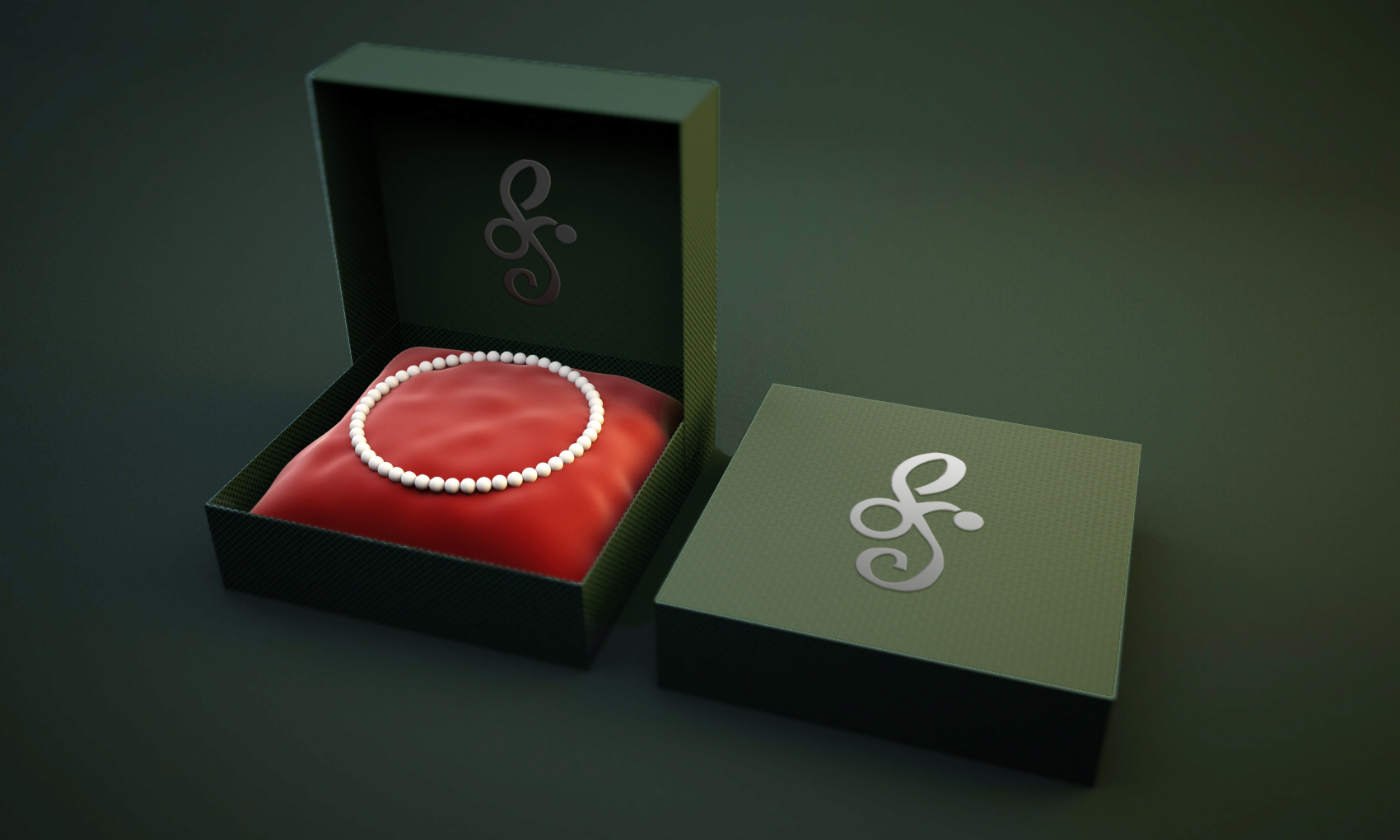
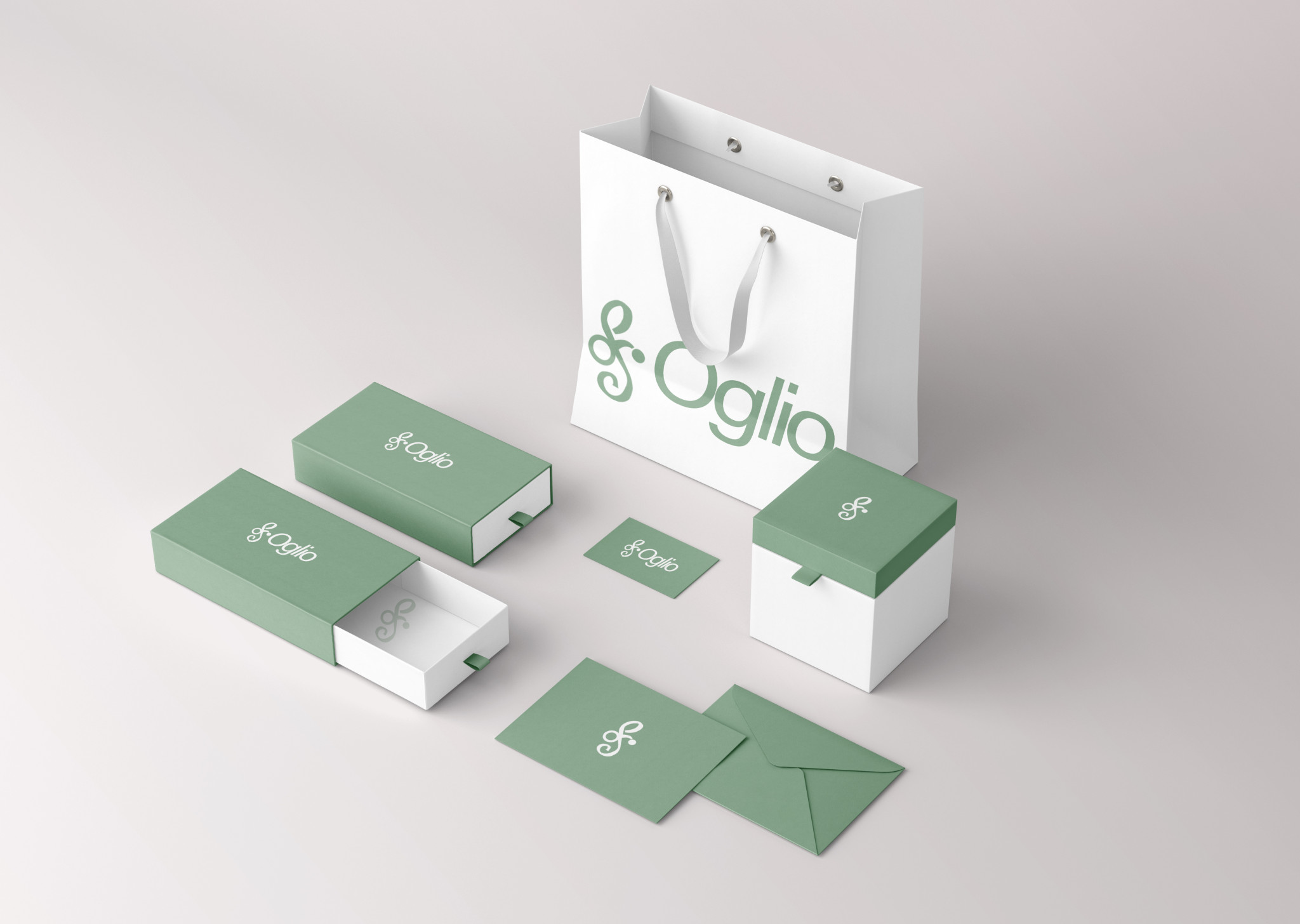
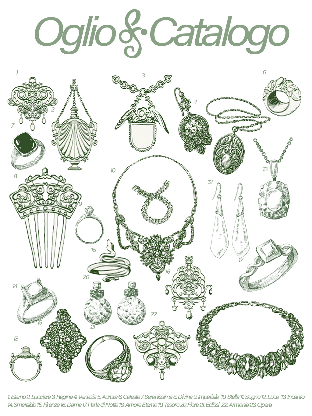
To do this, I defined a visual universe based on a soft colour palette, in light green and off-white tones, which evoke freshness, sobriety and closeness. I also worked on developing illustrations of unique pieces and creating an editorial catalogue that simulates the brand’s annual inventory, with the aim of reflecting both the exclusivity of each piece of jewellery and the rich craftsmanship behind the collection. The brand experience was completed with the design of packaging: bags, boxes and envelopes accompanied by cards designed for discounts or dedications, always seeking consistency in every detail.
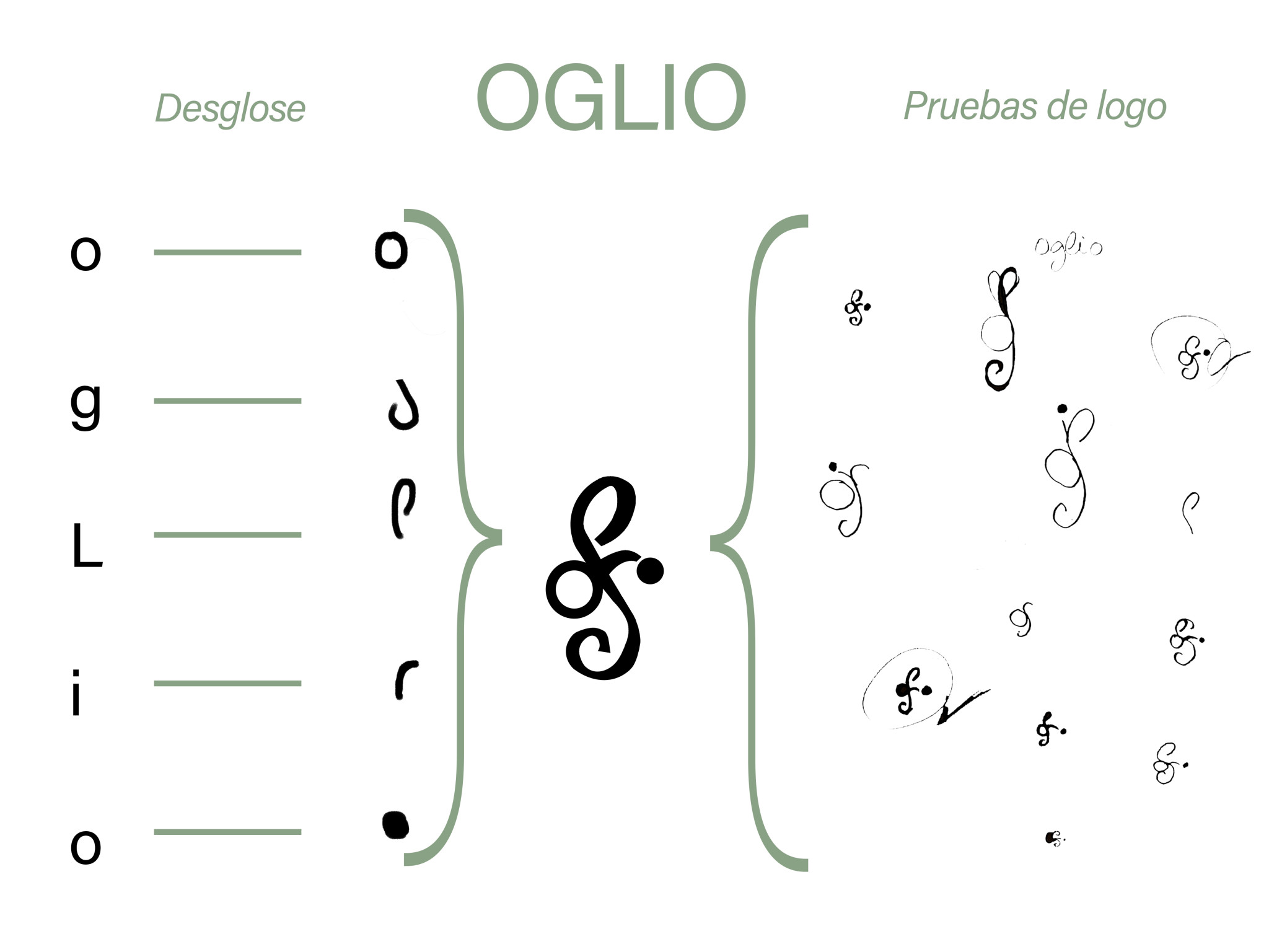
The biggest challenge was the logo. Inspired by the Oglio River, I explored fluid and typographic forms until I arrived at an identity that springs directly from the name, a play on letters that conveys balance, modernity and tradition.
This project allowed me to organically integrate branding, art direction and editorial design, creating a fictional brand that, despite not existing in the market, is perceived as real, solid and ready to inhabit it.
OGLIO

Brand Design [2025]

Oglio is a conceptual Italian fine jewellery brand that I developed as part of my portfolio. The idea came from imagining a family business with a heritage dating back to 1978, dedicated to timeless pieces that combine tradition and contemporary design. The big challenge was to build a visual identity from scratch that conveyed elegance, heritage and modernity at the same time. To do this, I defined a visual universe based on a soft colour palette, in light green and off-white tones, which evoke freshness, sobriety and closeness. I also worked on developing illustrations of unique pieces and creating an editorial catalogue that simulates the brand’s annual inventory, with the aim of reflecting both the exclusivity of each piece of jewellery and the rich craftsmanship behind the collection. The brand experience was completed with the design of packaging: bags, boxes and envelopes accompanied by cards designed for discounts or dedications, always seeking consistency in every detail. The biggest challenge was the logo. Inspired by the Oglio River, I explored fluid and typographic forms until I arrived at an identity that springs directly from the name, a play on letters that conveys balance, modernity and tradition. This project allowed me to organically integrate branding, art direction and editorial design, creating a fictional brand that, despite not existing in the market, is perceived as real, solid and ready to inhabit it.
Resumen de privacidad

Esta web utiliza cookies para que podamos ofrecerte la mejor experiencia de usuario posible. La información de las cookies se almacena en tu navegador y realiza funciones tales como reconocerte cuando vuelves a nuestra web o ayudar a nuestro equipo a comprender qué secciones de la web encuentras más interesantes y útiles.